Designs
An overview of all custom Layout Builder blocks.
The distribution has shipped with two versions of Layout Builder component designs. The first-generation “Pre-release” designs were shipped with version 9.2.12 (December 2022) and 9.2.13 (March 2023). The revised and feature-complete “Design System” designs shipped with the June 2023 release.
Design System
Colorways
Based on the YMCA Brand Guide, the distribution contains four “colorways” that allow content editors to apply accessible, brand-compliant styles to all components on a Layout Builder-based page.
| Blue | Green | Purple | Red |
|---|---|---|---|
 |  |  |  |
Content Types
The distribution provides new Content Types for use with Layout Builder components.
| Article | Branch | Camp | Event |
|---|---|---|---|
 |  |  |  |
Components
Each of these components is available on Layout Builder pages via the Create custom block selector.
| Component | Design |
|---|---|
| Accordion |  |
| Amenities |  |
| Article List |  |
| (Hero) Banner |  |
| Branch Hours |  |
| Branch Menu |  |
| Branch Preferred Branch |  |
| Branch Social Links |  |
| Breadcrumbs |  |
| Camp Menu |  |
| Camp Video Banner |  |
| Card |  |
| Card - Column Variations |  |
| Carousel |  |
| Donate |  |
| Event List |  |
| Forms |  |
| Global Footer |  |
| Global Header |  |
| Grid Content |  |
| Icon Grid |  |
| Icons and Logos |  |
| Locations |  |
| Menu and Search |  |
| Modal |  |
| Ping Pong |  |
| Promo Cards |  |
| Side Menu |  |
| Sponsors |  |
| Staff |  |
| Statistics |  |
| Table (Simple Content) |  |
| Tabs |  |
| Testimonials |  |
| Utility Menu |  |
Pre-release
View the designs
| Component | Mobile | Desktop |
|---|---|---|
| Accordion |  |  |
| Article (/News /Blog /Press Release) |  |  |
| Branch |  |  |
| Branch Amenities |  | 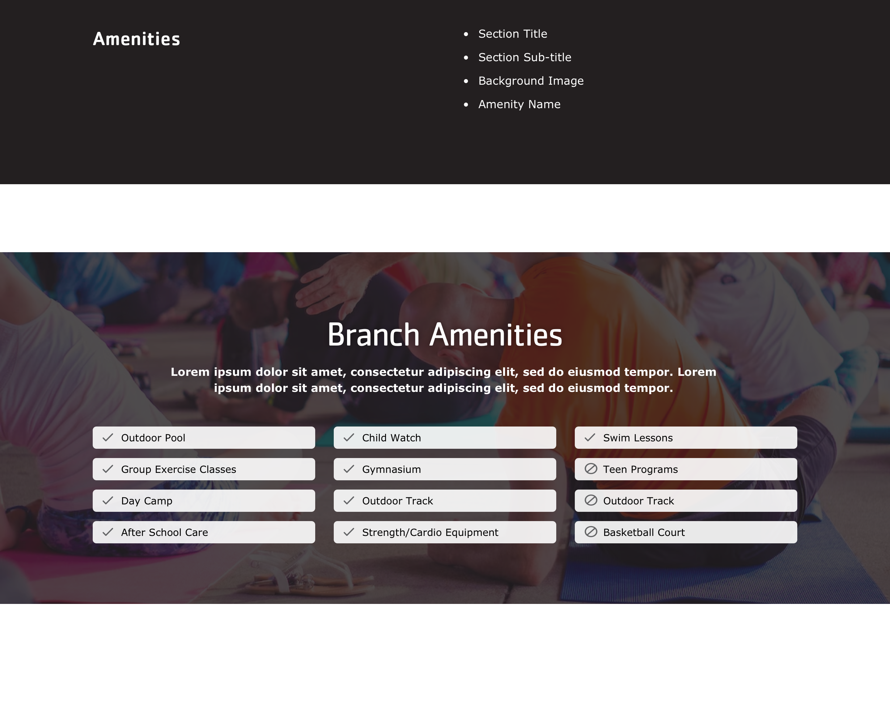 |
| Branch Hours | 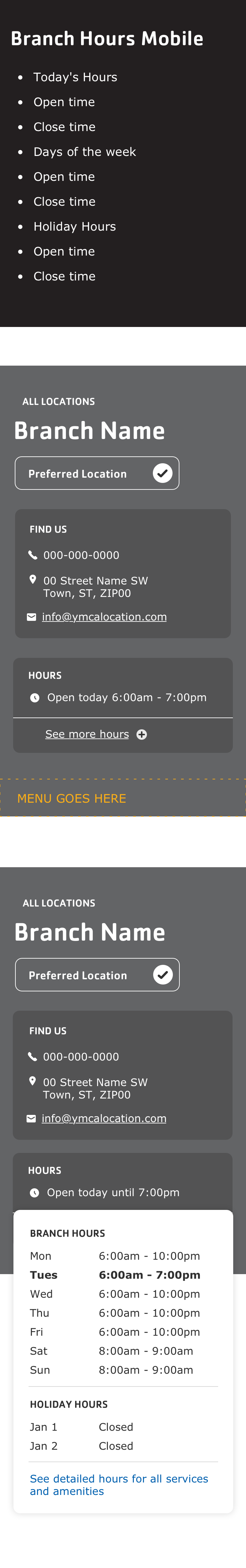 | 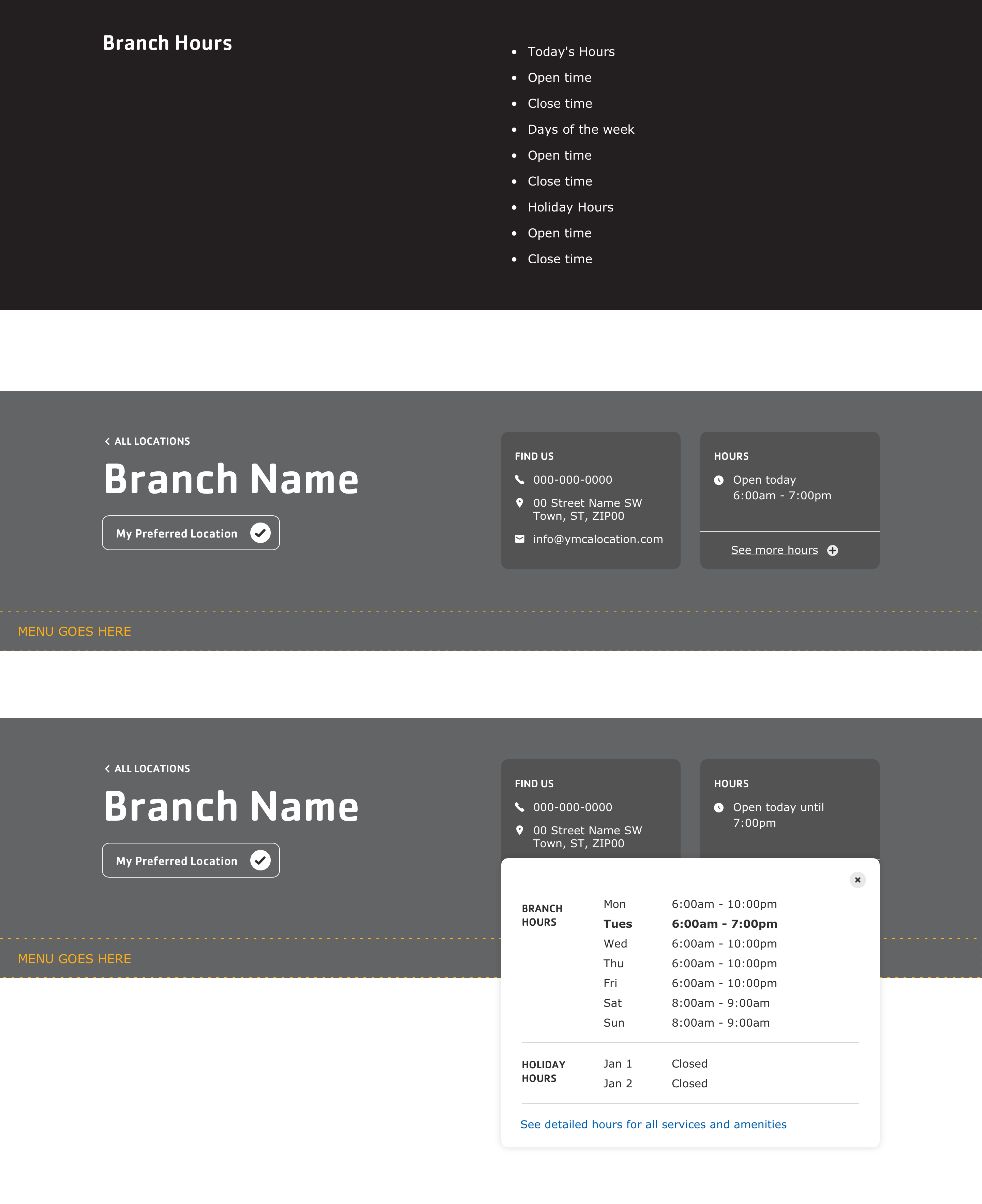 |
| Branch Menu | 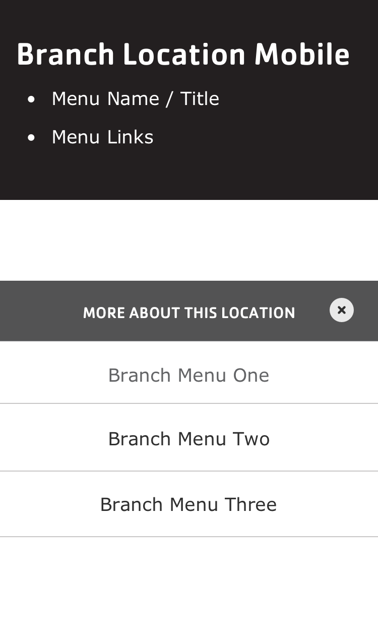 | 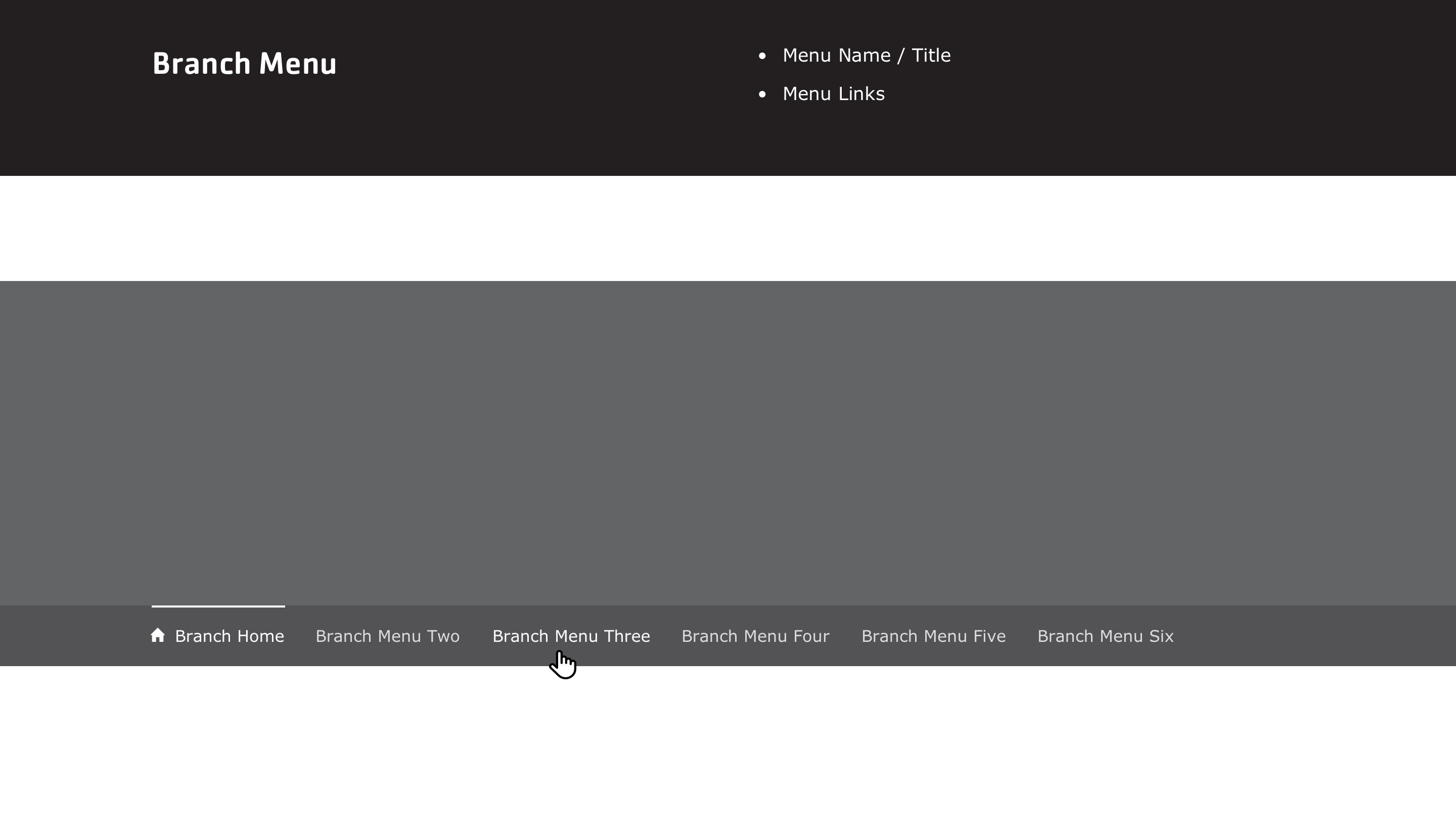 |
| Branch Social Links | 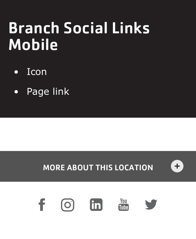 | 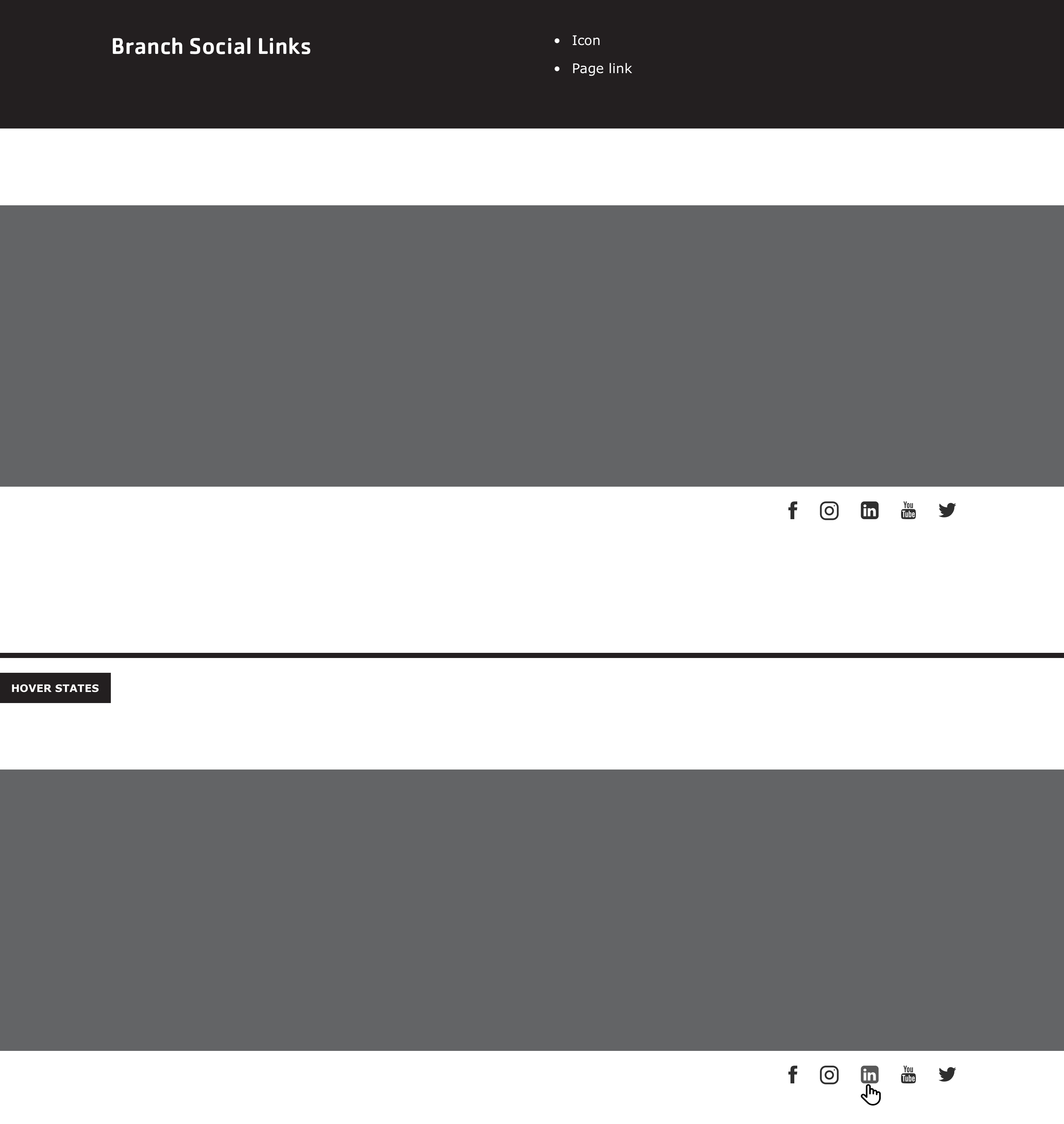 |
| Breadcrumbs |  | 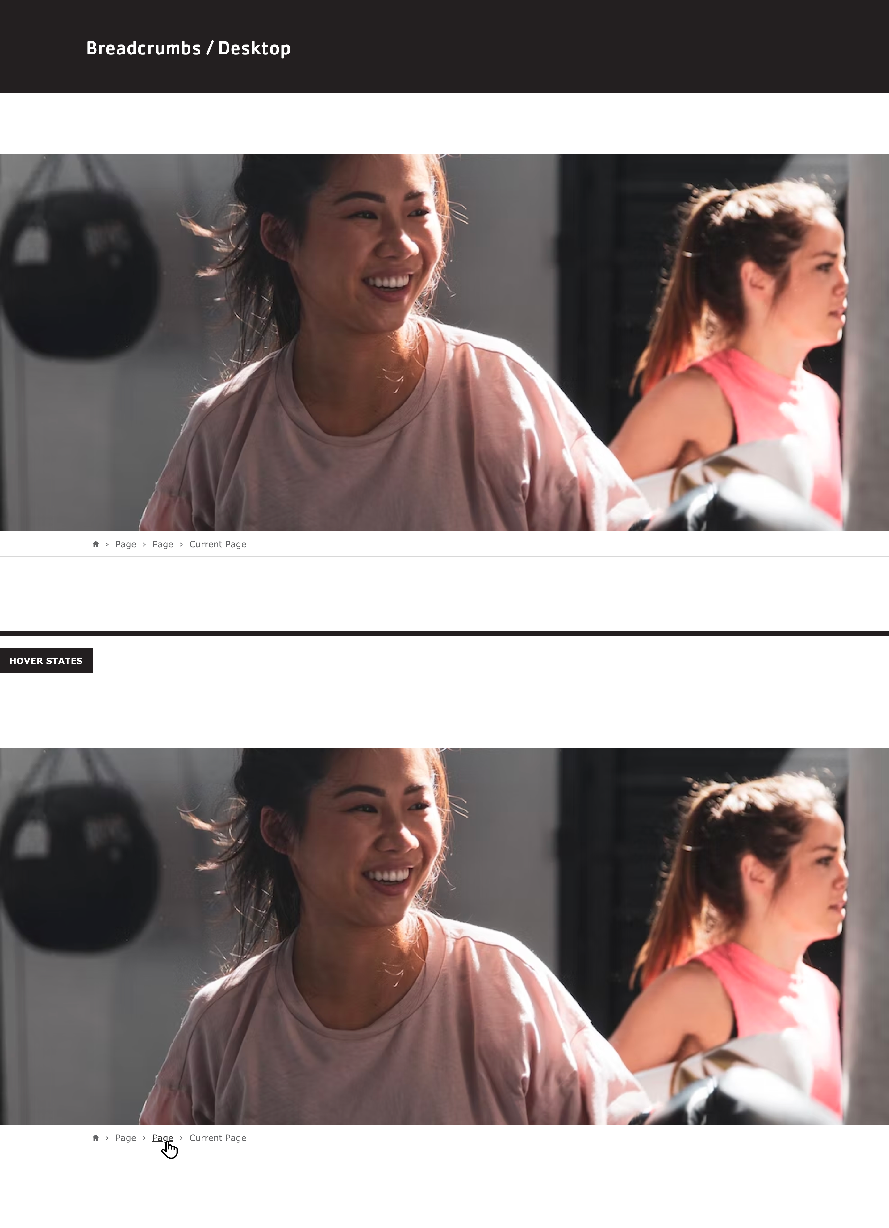 |
| Cards | 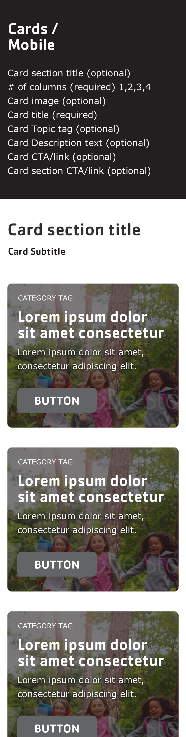 | 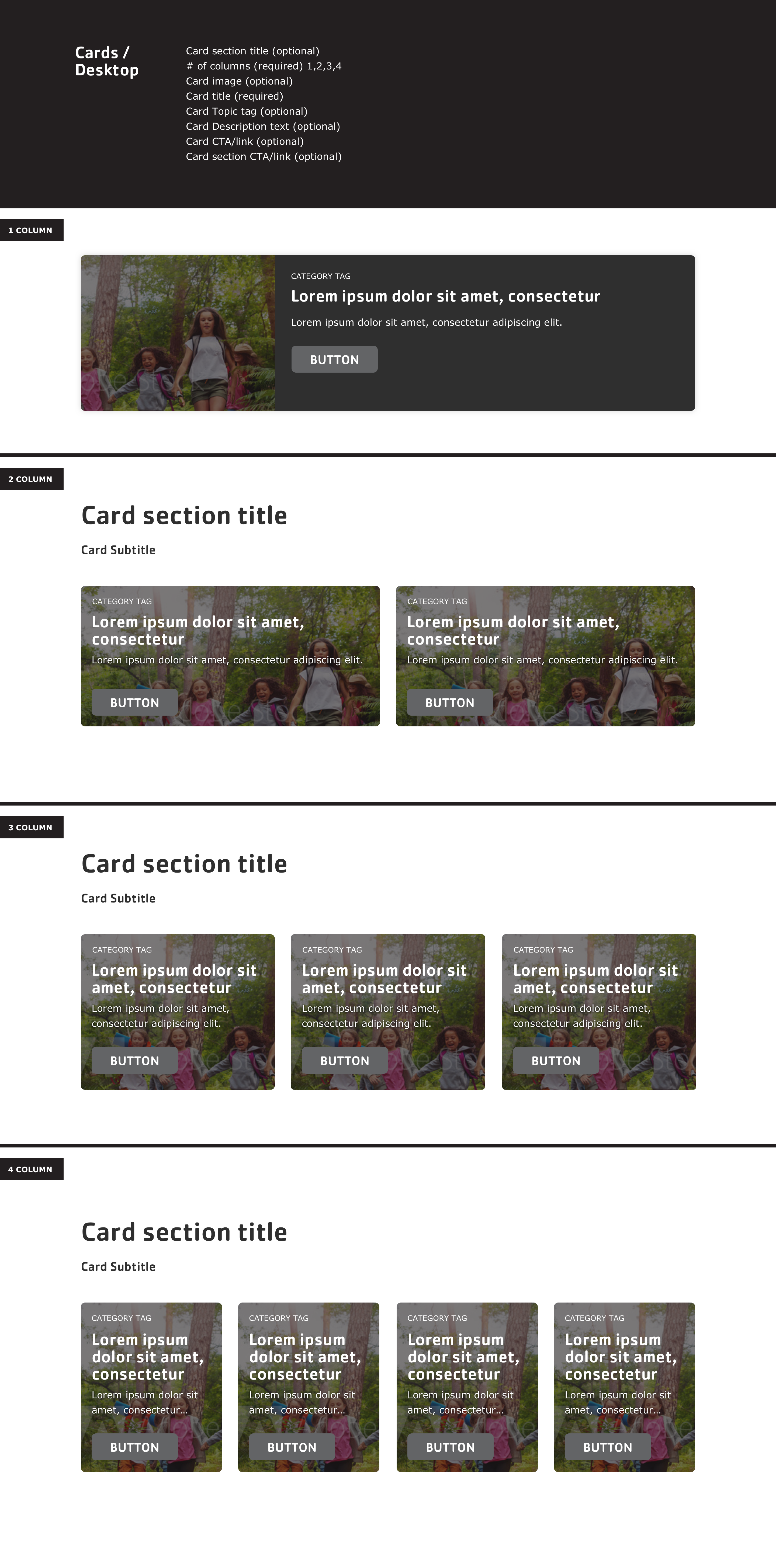 |
| Carousels | 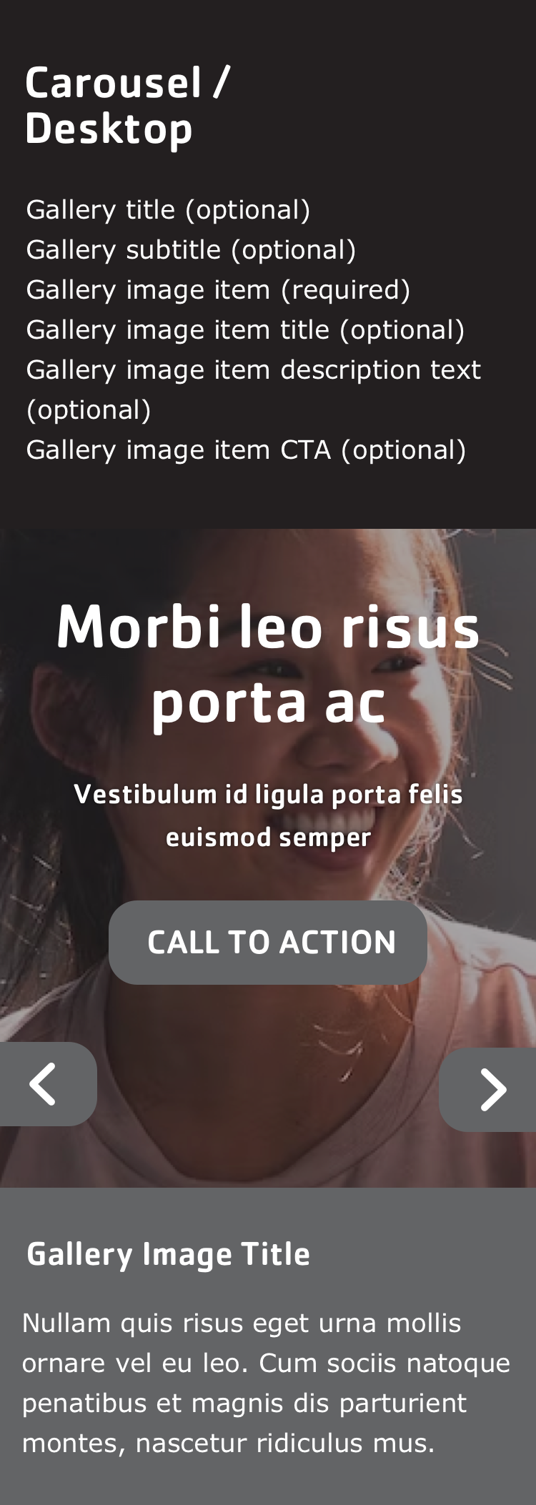 | 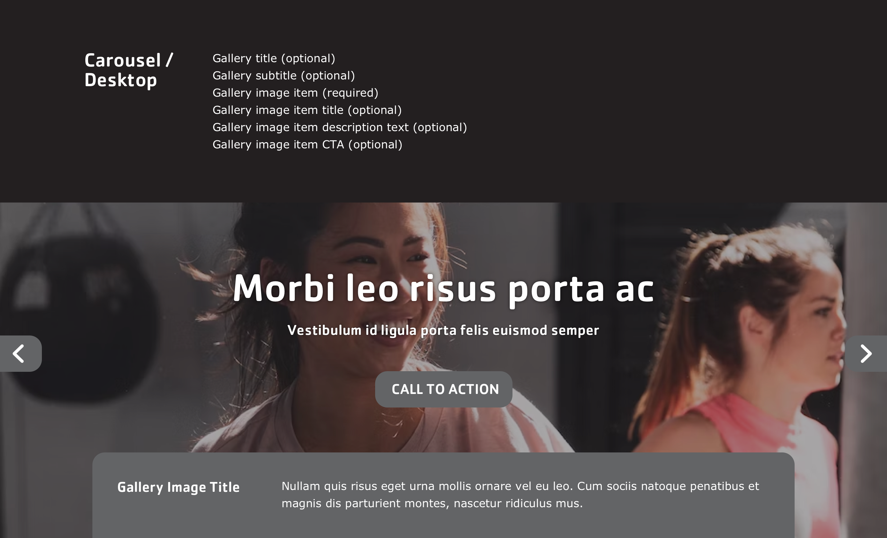 |
| Event |  |  |
| Grid Content |  |  |
| Hero Banner |  | 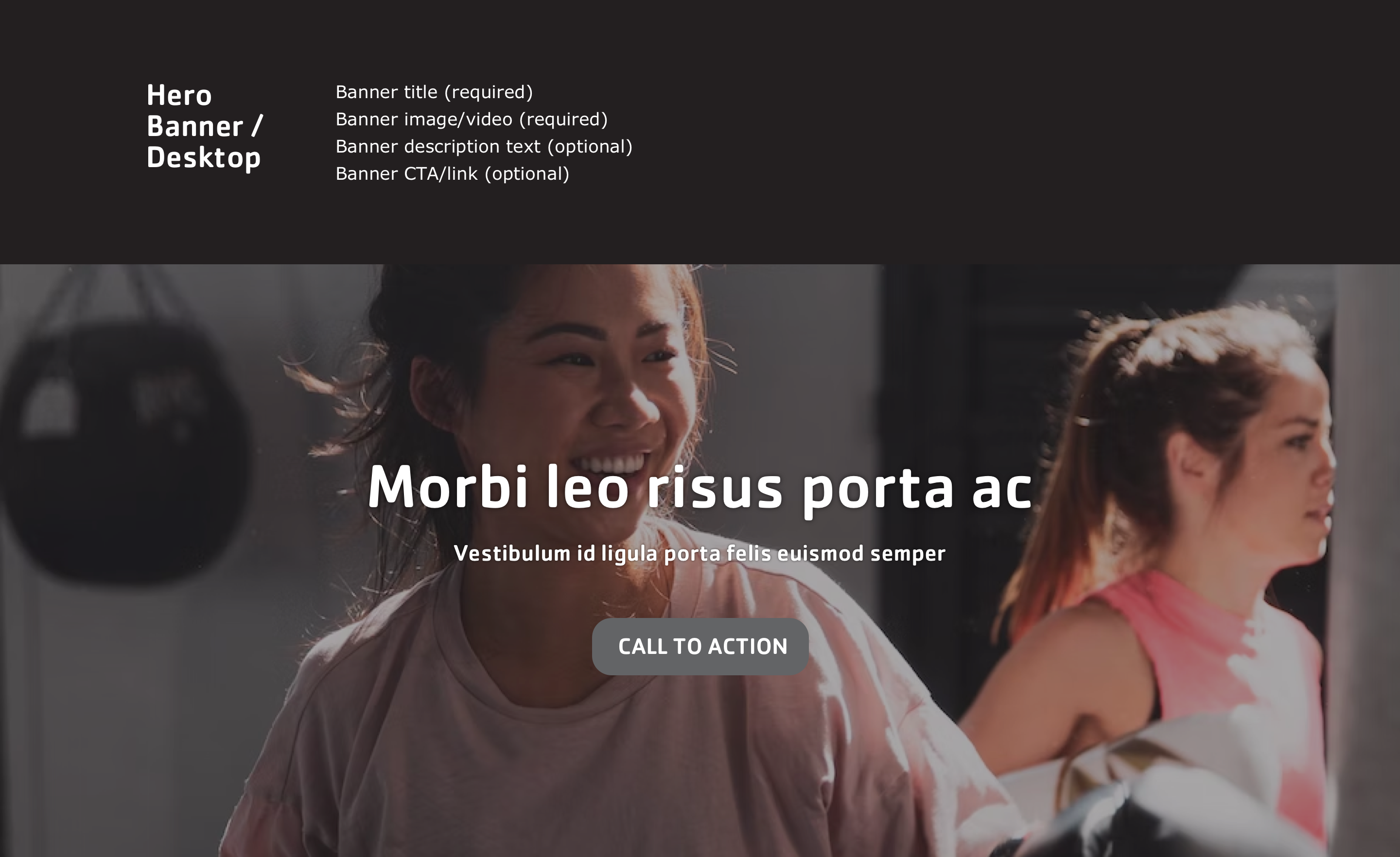 |
| Modals | 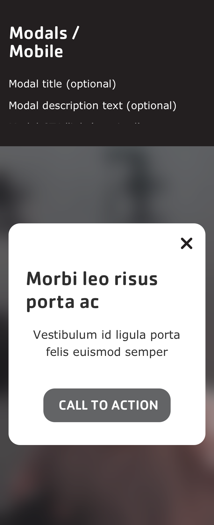 | 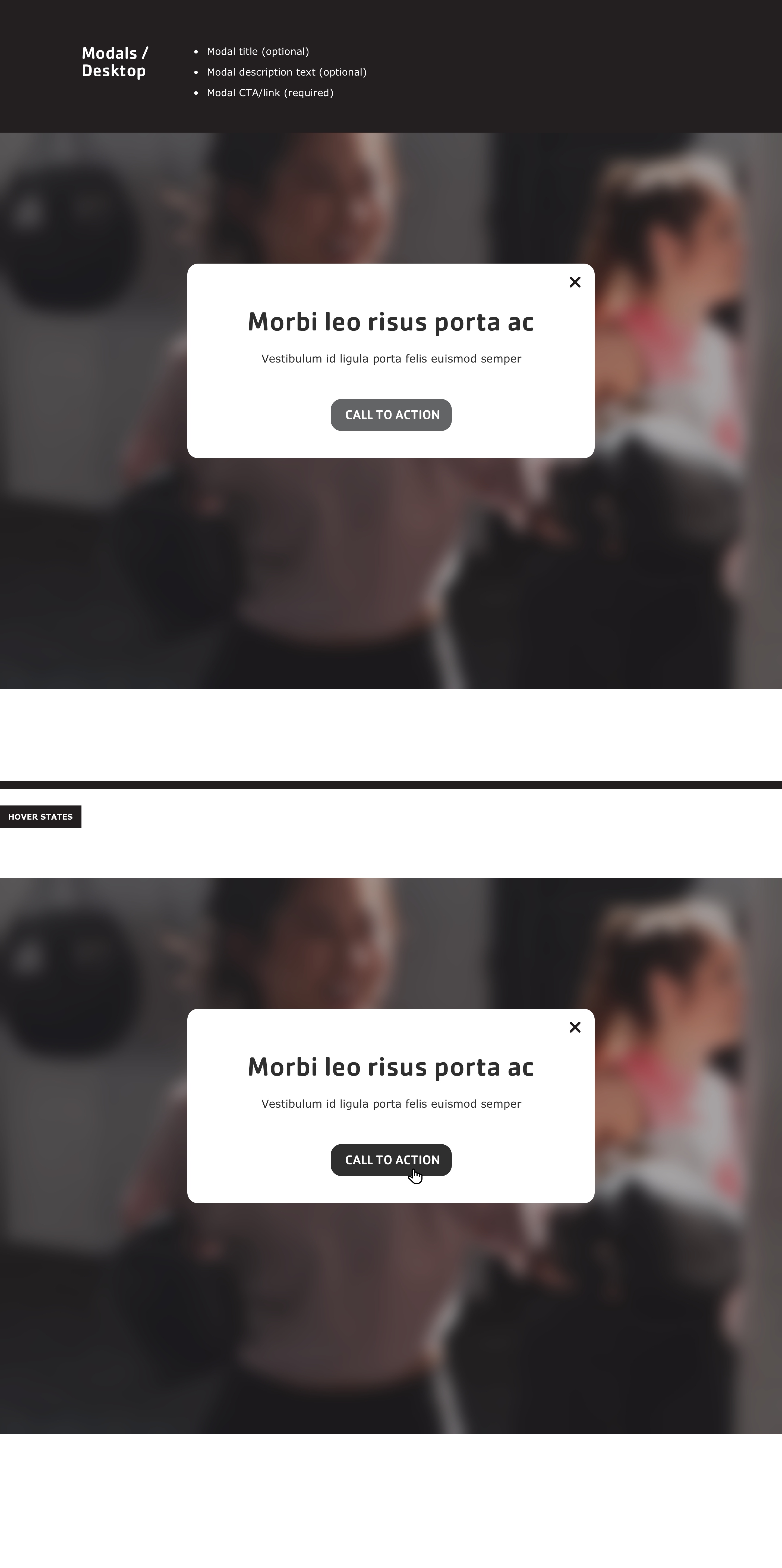 |
| Modals | | |
| Partners (/Sponsors) | 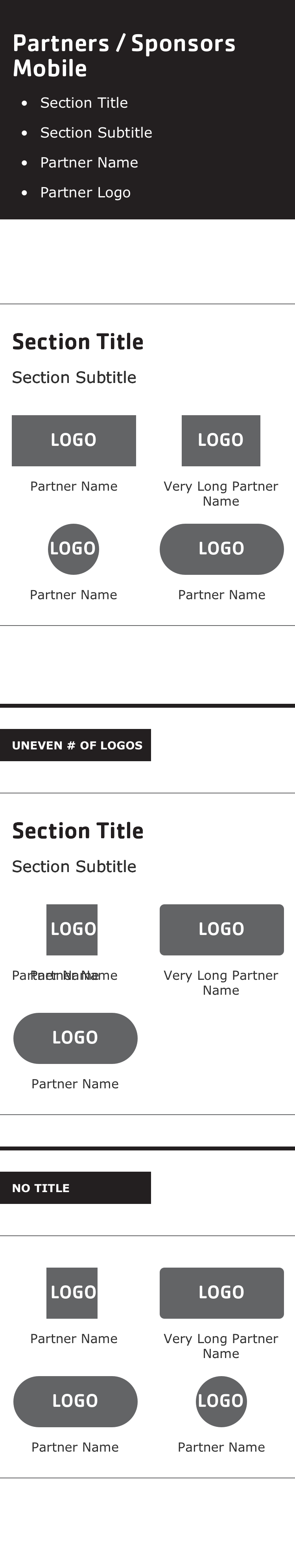 | 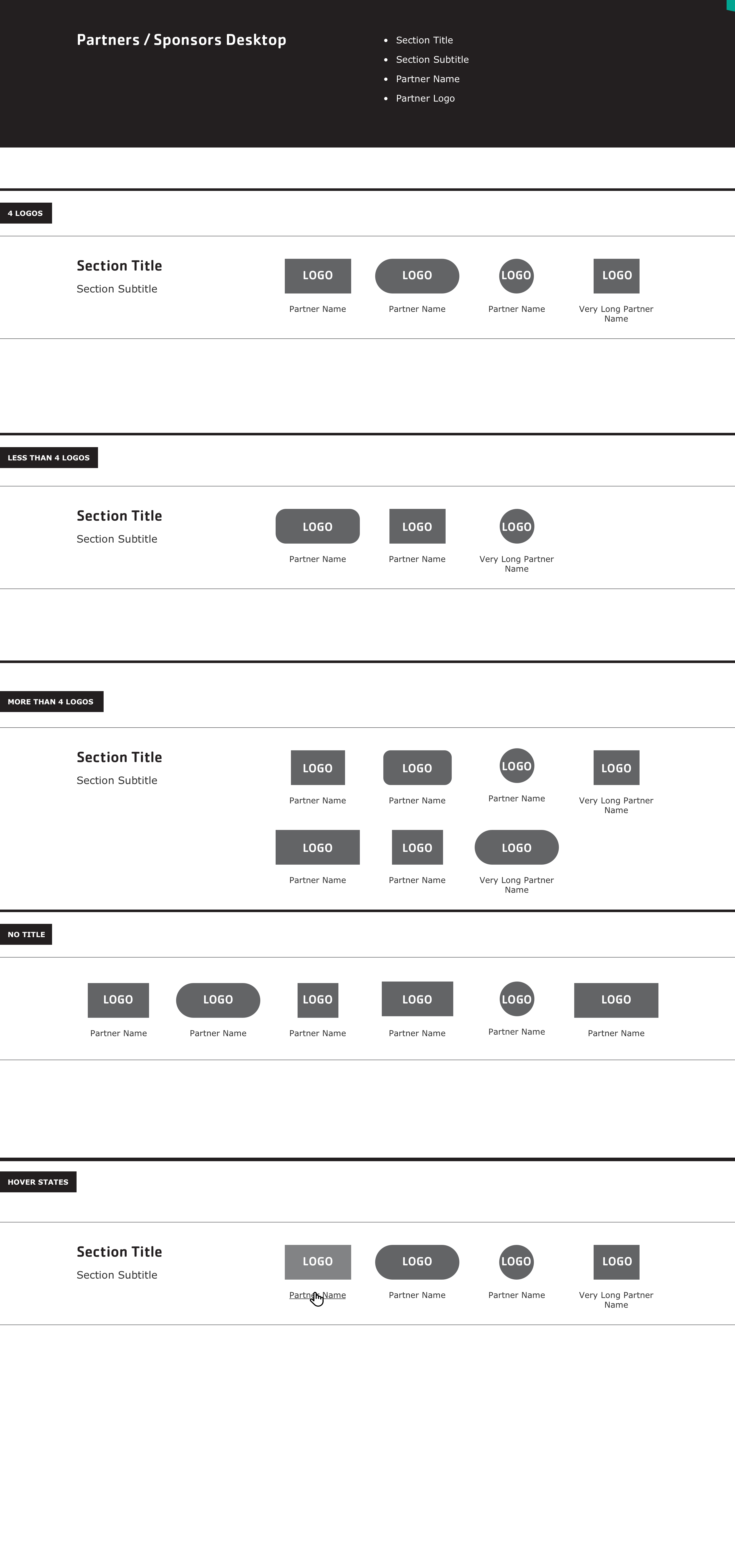 |
| Ping Pong | 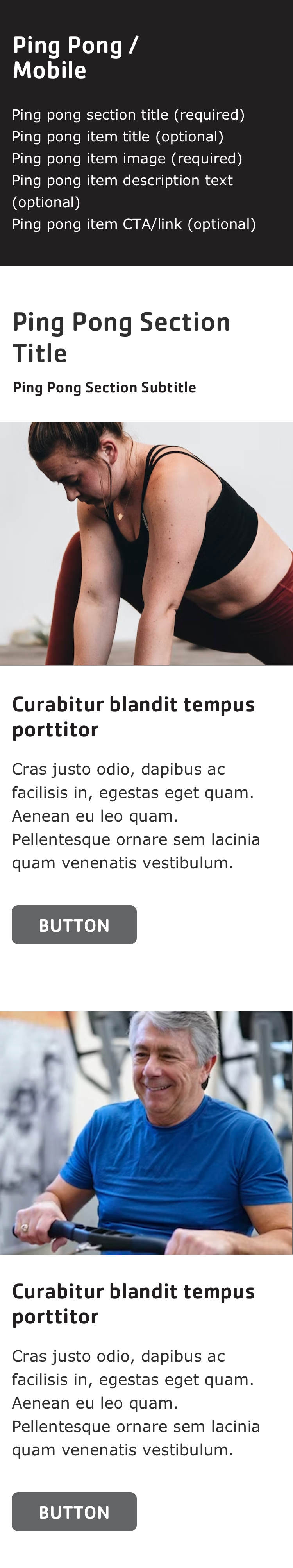 | 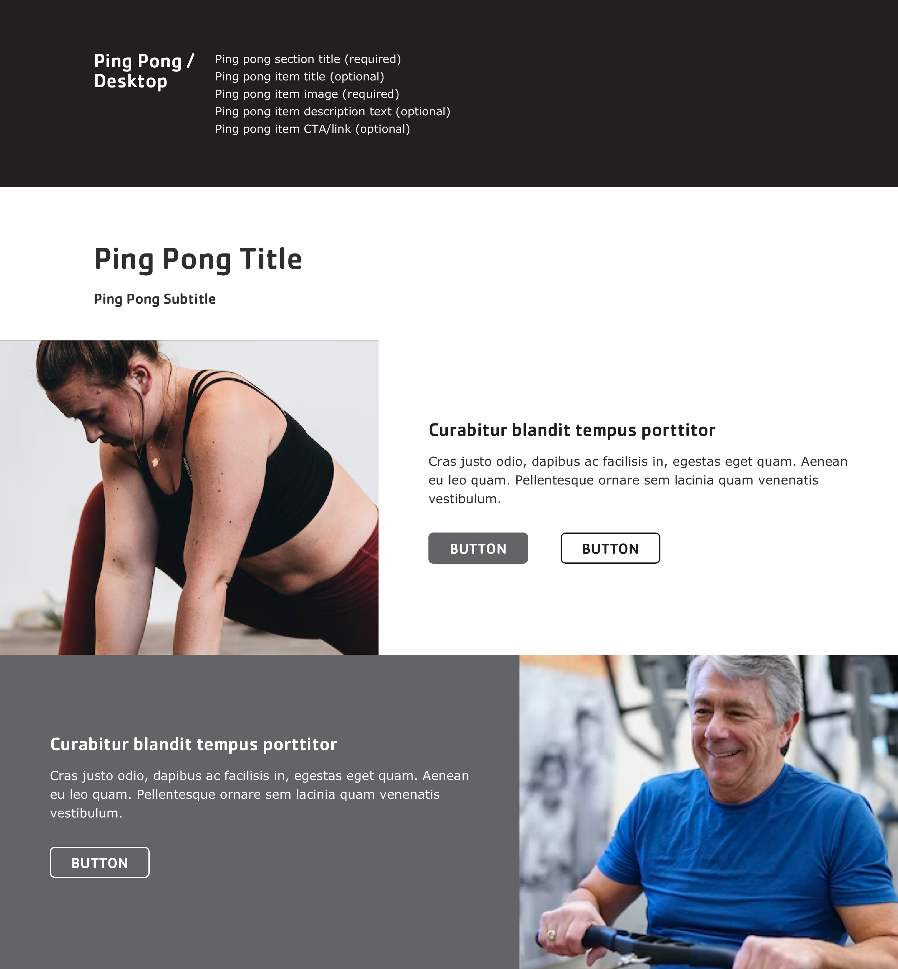 |
| Promo Cards | 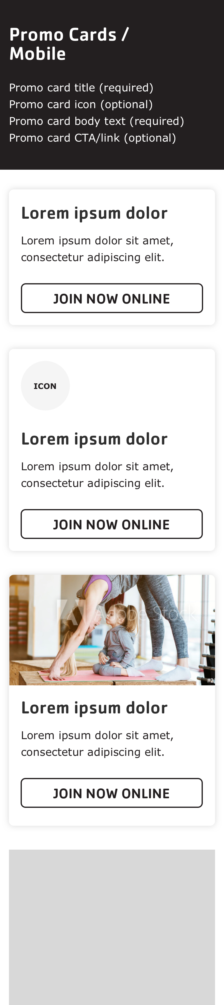 | 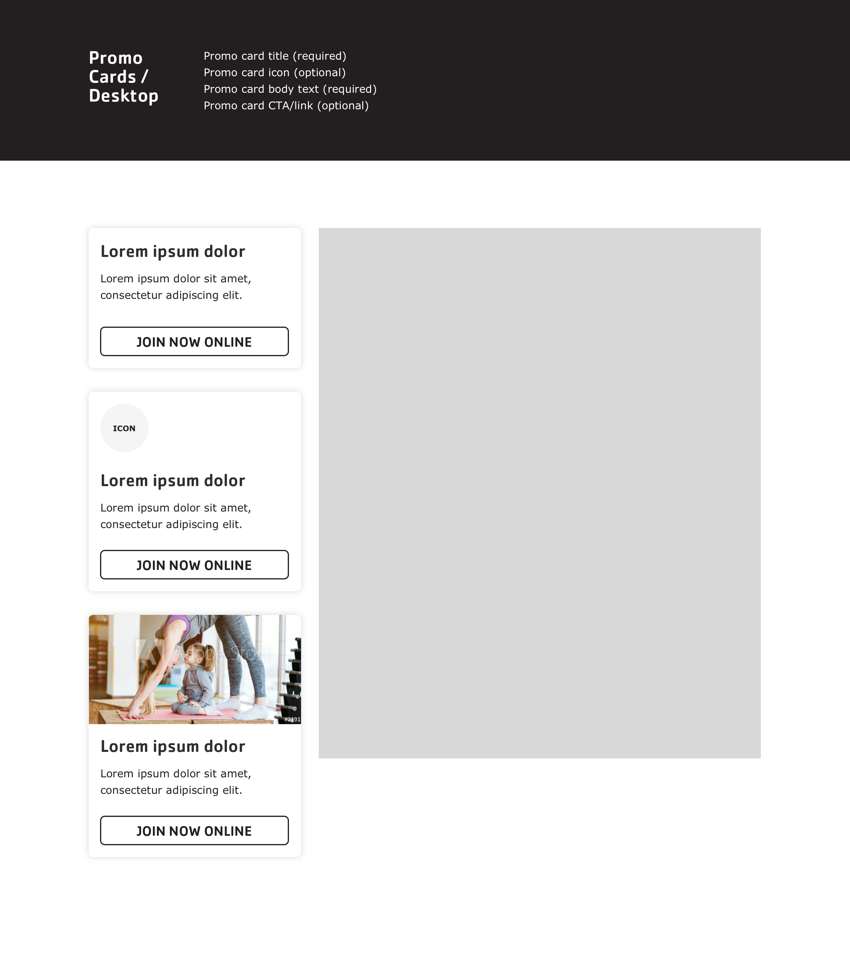 |
| Simple Menu | 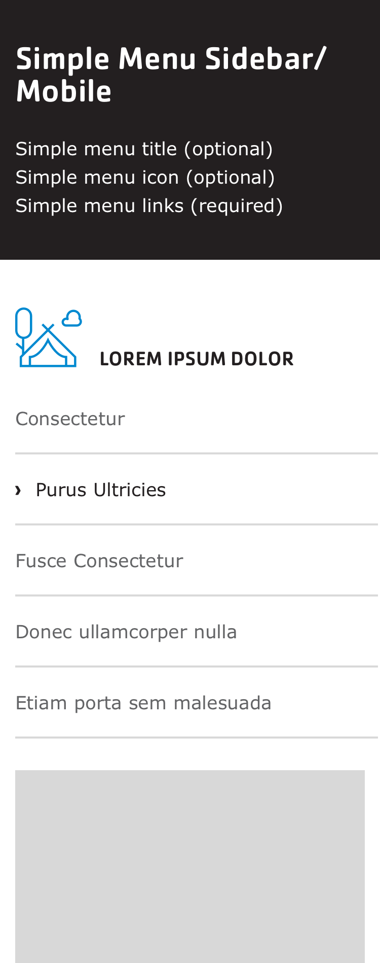 | 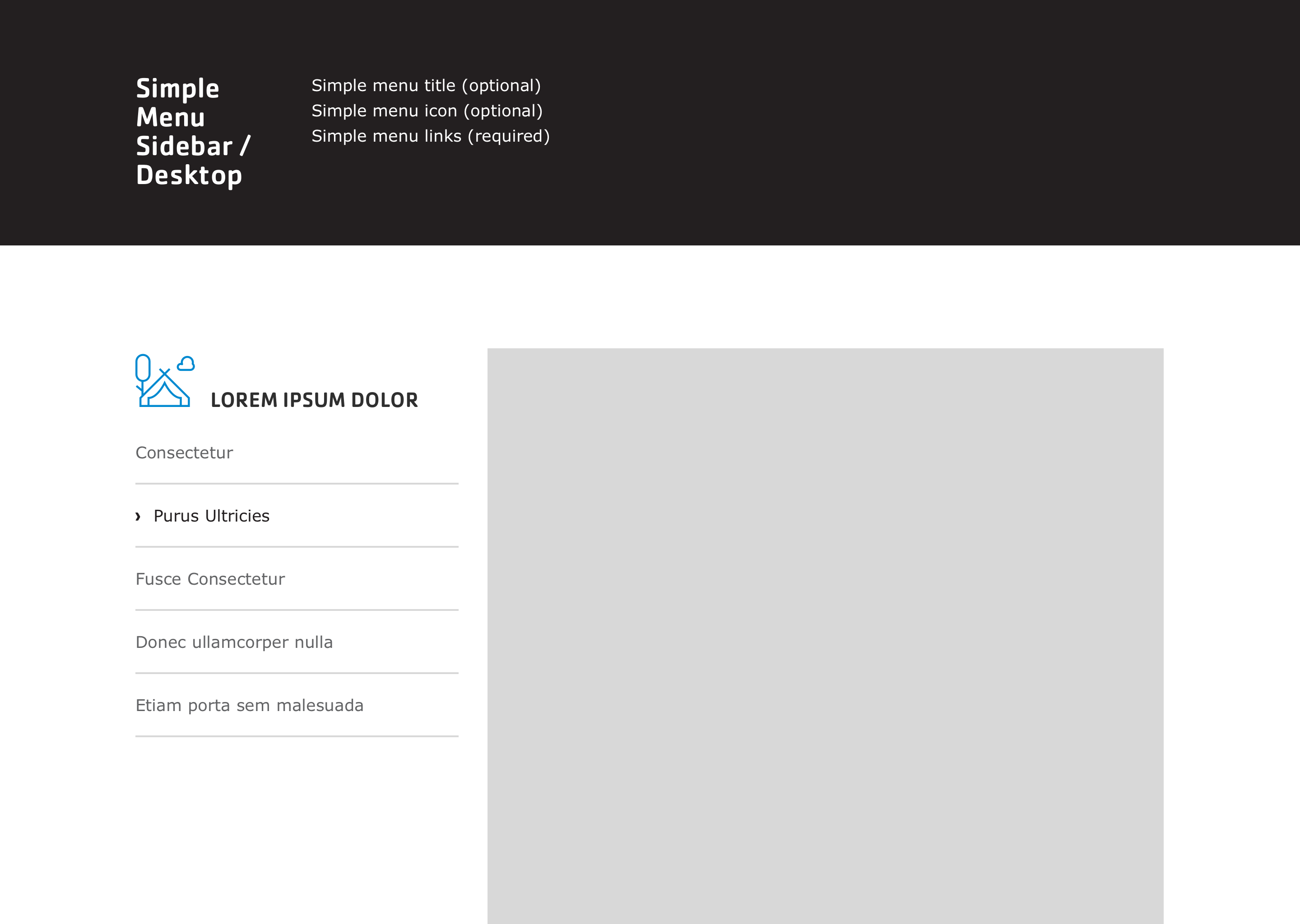 |
| Staff |  | 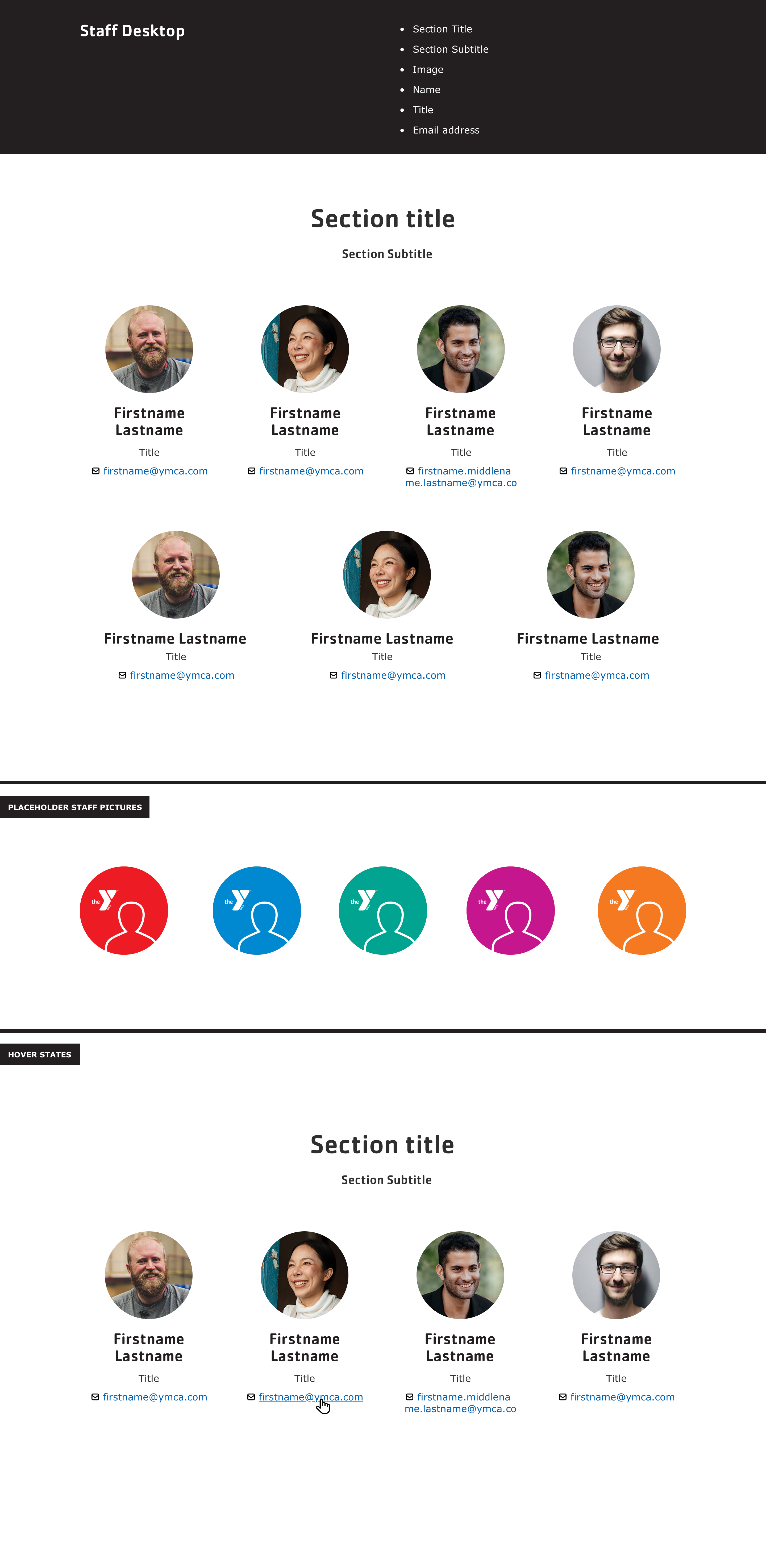 |
| Statistics |  |  |
| Tables |  |  |
| Tabs | 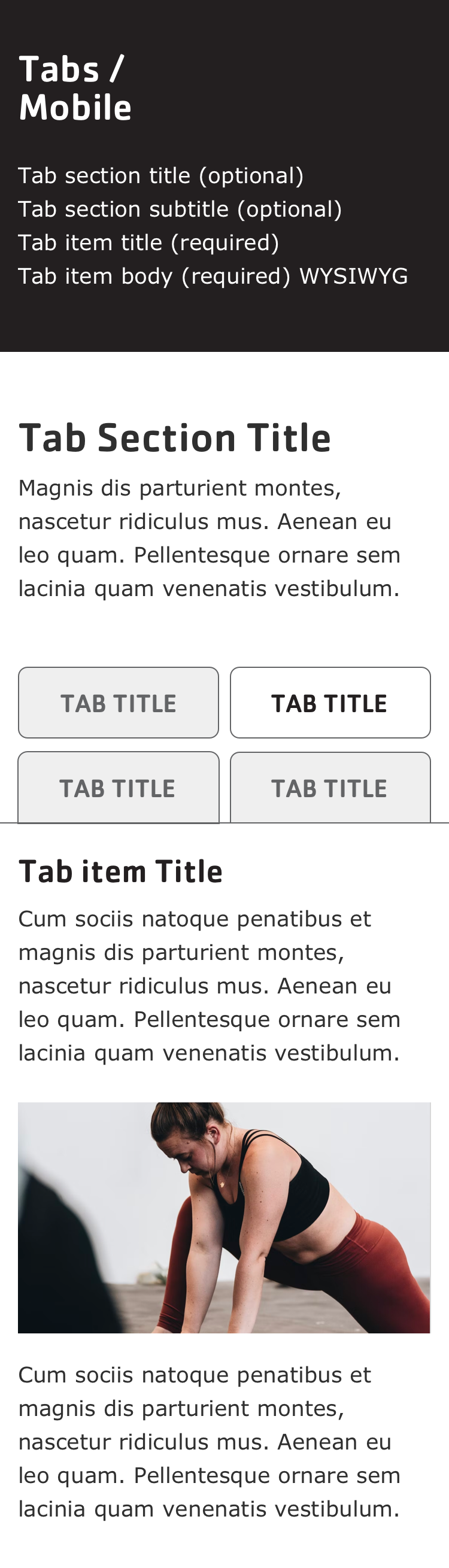 | 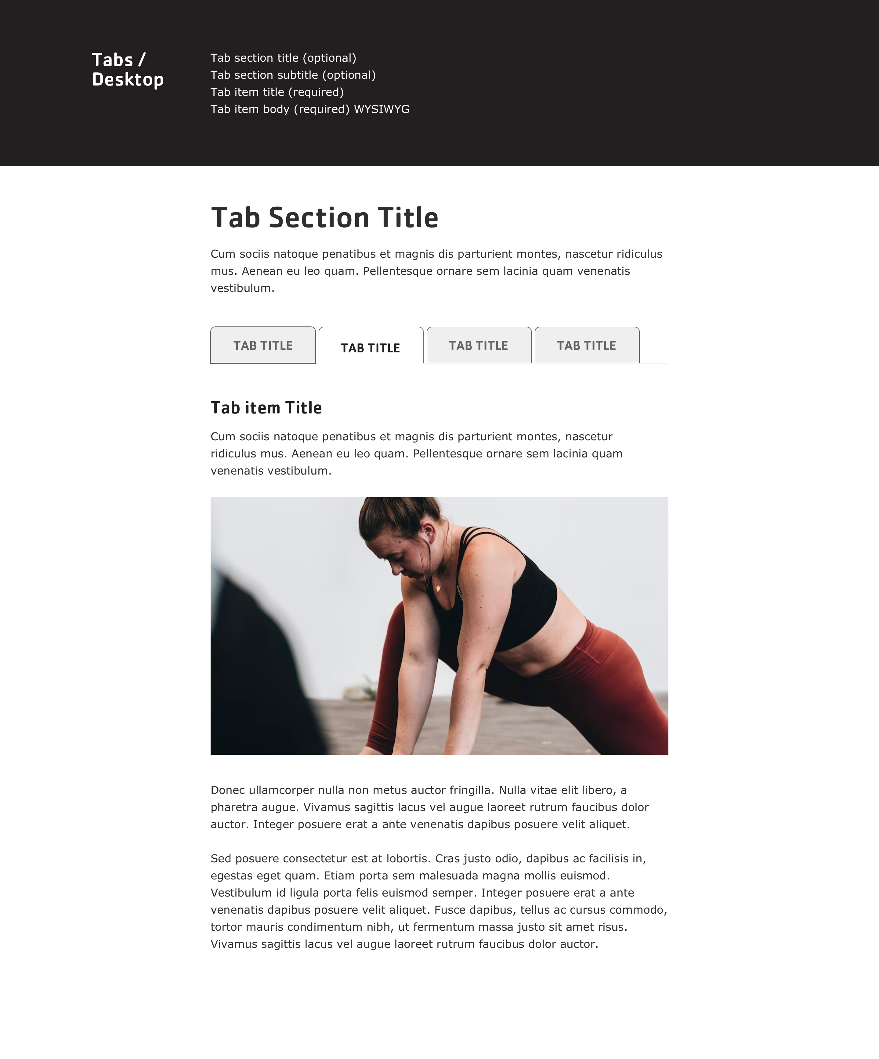 |
| Testimonials |  | 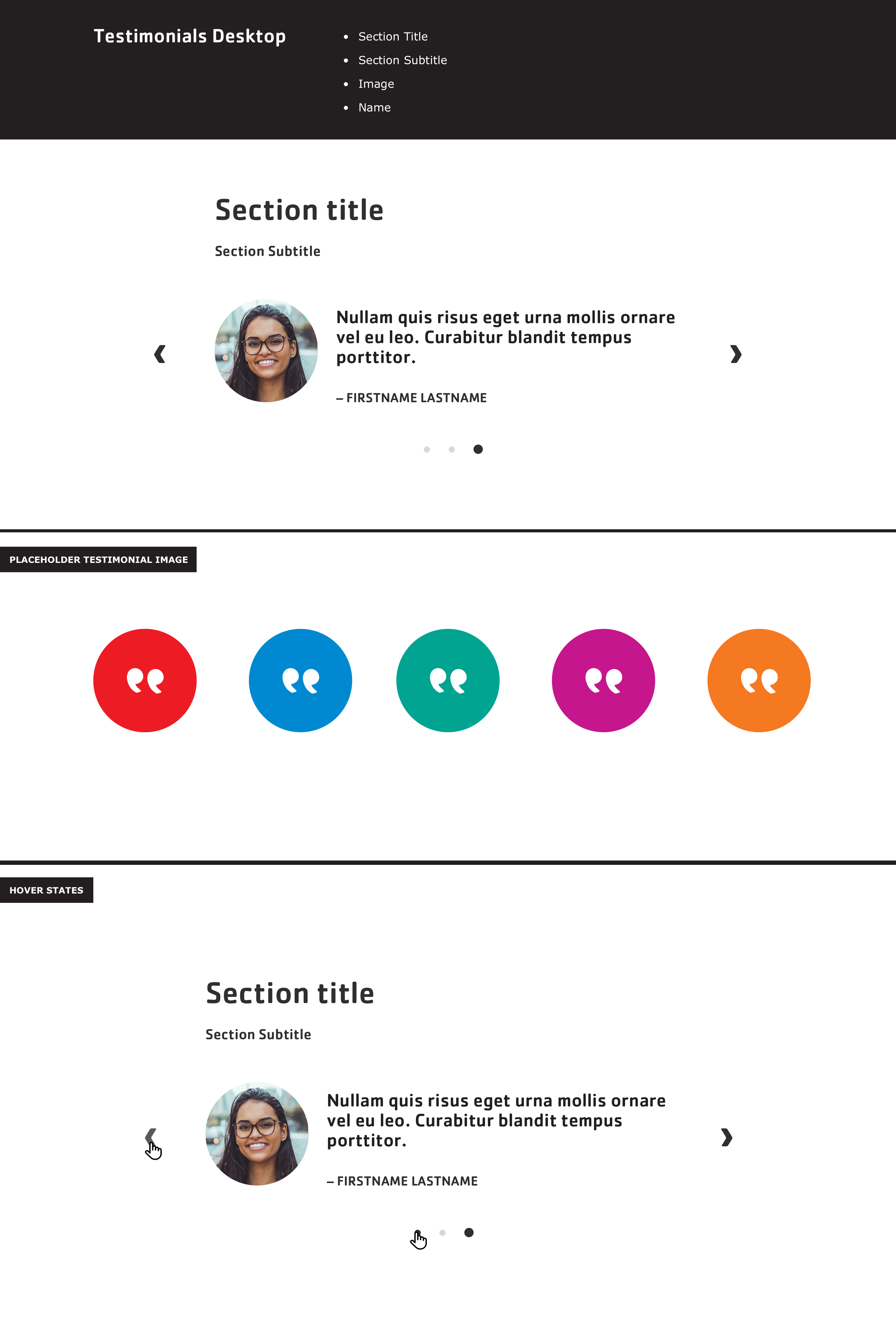 |
| Webforms | 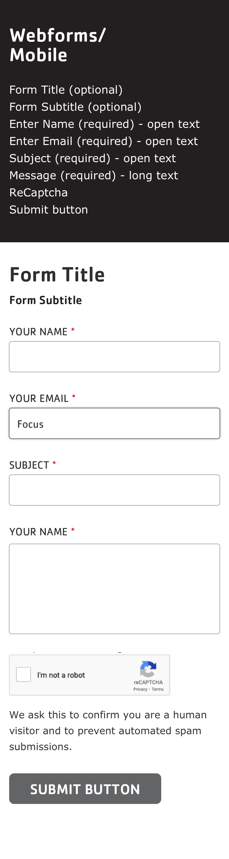 | 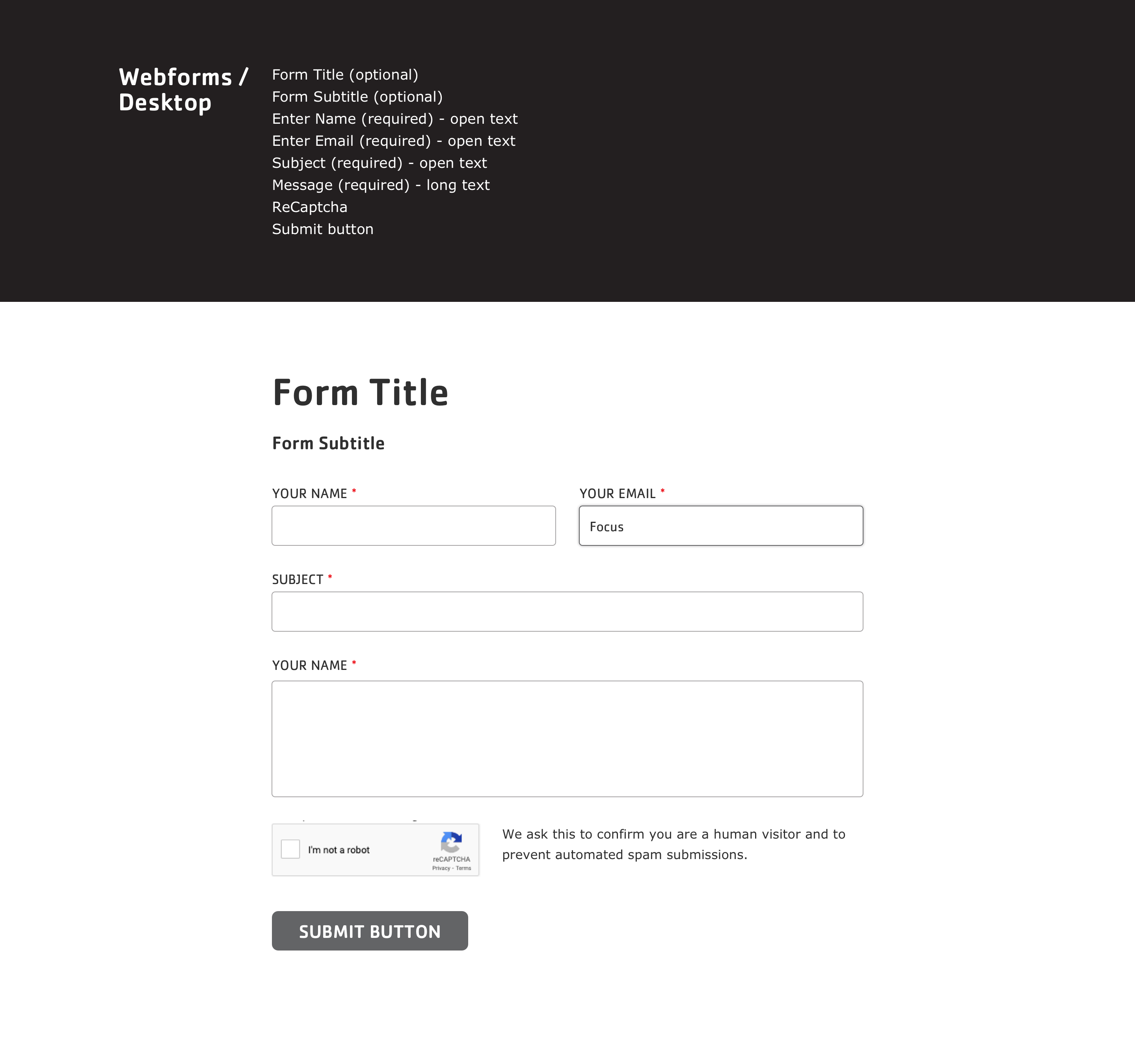 |
Last modified September 19, 2023: docs: DS-1041 Add Icon Grid user docs (2bbce692)